🔷 ACM Membership Portal Redesign
Redesigning the way 1000+ members interact with the ACM UC San Diego Membership Portal
ACM was the first student organization at UC San Diego to create an in-house membership portal. It is now used by 1000+ members within ACM’s first year since founding.
I was part of an ACM Design team project to redesign and create new features on the ACM Membership Portal for UC San Diego’s largest technology organization.

Game-ify the events experience
The original goal of the portal was simple: game-ify the events experience to improve member experience. Members check into membership portal, are rewarded with points, then climb the leaderboard. As ACM grew, we noticed there was not enough focus on member experience in the membership portal. It lacked information centralization — event notifications were on Facebook, communication was on Discord, and since members only spent 1 minute per membership portal session on average, its simplicity now seemed feature-barren.
The challenge
The first membership portal was created when there were no exisiting users, design team, or design standards. After a year of deployment and the creation of ACM Design, I had the chance to reflect and strategize an improved membership portal. I wanted the redesign to be centered around two goals: member experience and efficiency. This brought me to the blanket problem statement:
How might we design a more engaging membership portal for meaningful, fluid, member interactions?
My role
I lead the new feature creation through product design, contributed to the interactions of the portal through user experience design, spearheaded constructing style standards for pixel-perfect interfaces through visual design, and coordinated tasks, delegation, and collaboration through product management.
I worked part-time, approximately 15 hours a week alongside four designers and two developers from March 2020 to June 2020.
ACM’s mission is to “foster an inclusive member-first community.” I was the Vice-President Membership for a year with my sole mission being to curate the best member experience possible. To be able to design for member experiences was everything to me.
The redesigned membership portal will launch in December 2020.
Design process: The double-diamond
We followed the double-diamond design process, diverging in our user interviews and prototypes and converging during two Design Jams per week to discuss results, make design decisions, and design together.

Initial user research: Discover member motivation
I wanted to find clear paths to set for focusing on feature design.
My research goals were to:
- Identify how the portal has contributed to the ACM community
- Discover user motivation for using the portal
- Uncover user pain points
Surveys: Discovery
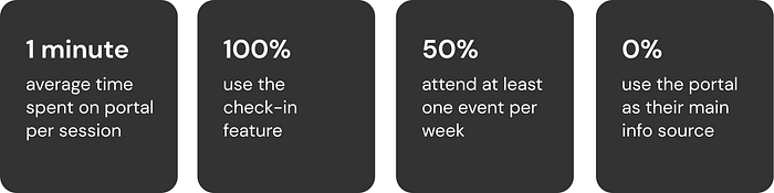
I began by surveying volunteer users on the original membership portal user interface. Here are some of the key user statistics from the survey:
Interviews: Deeper insights
I then spearheaded interviewing members that took the survey to try to get qualitative answers to the survey statistics. Here is some of the key feedback received:
There should never be a point where someone can’t find something ACM-related or has to ask about it — Sumeet
I wish members could have their own pages to host their own content — Ronak
It would be nice to have feedback forms. Members like to be heard — David
Competition is good. People at the top of the leaderboard make others want to compete with them— Ivy
Reframing the problem
Based off of the survey statistics and the interview feedback I drew some conclusions:
- Events with check-in codes are the heart of ACM portal engagement
- Since members spend ~1 minute on the portal and all members use the check-in feature, that is enough time to enter the check in code and confirm success but nothing more
- At least half these members are attending events therefore interacting with the portal but it is not engaging enough to be used for more than check-in
- The leadership board the second main source of membership portal’s interactivity between fellow members but only for those at the top
- Members want connection and the ability to give feedback
Springing off the original problem statement to new goals, three key design challenges emerged:
- How might we improve member connection and contribution?
- How might we centralize ACM information?
- How might we create seamless event interactions?
ACM Design team’s informal problem statements were made in jokes but reflected reality as well:
Let’s make this portal redesign the talk of the down — Jack, Designer
We want it to be the one-stop-shop ACM hub — Amy, Designer
Ideation and wireframes: Opportunities to improve
The features of the original portal were Profile, Event check-in, Events, Leaderboard, About ACM, and a link to our Discord.
We wanted to retool these and create new features to initiate member engagement. I kept my personal goals of member experience and efficiency at all stages of looking for opportunities to improve the design.
Low-Fidelity Prototype: Humble beginnings
At this point we decided which device to design around. Since most of ACM’s events are in-person, members use their phones to check in. We observed on average members use around an iPhone 8 to iPhone X size screen, both of which have the same width, so we designed mobile-first.
My low-fidelity prototypes improved features of the initial membership portal including compartmentalizing the main page, giving clear, enticing links to other pages, being able to filter events, a more interactive profile, and a more poppy, informational about page.

Ideation into implementation: The membership portal redesign process
The membership portal redesign was a passion project and labor of love for the members ACM. Here were my key feature changes based on issues I found in user testing and membership portal data:
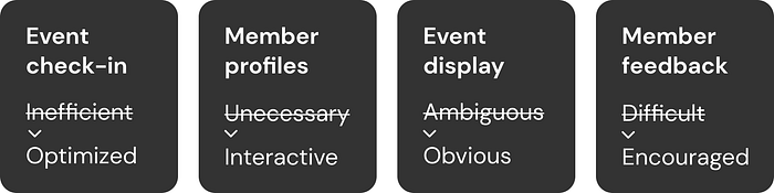
Event check-in: Creating an optimized experience while connecting members
When members attend events, they are able to check-into events through the portal. This check-in enables ACM to continue hosting events and is required by UC San Diego for ACM to receive funding from the school.
I found it takes a minimum of 8 taps and typing and a maximum of 22 taps and typing to go from a locked phone to a logged in/registered and checked in member.
ACM hosted 131 events with 3481 portal check-ins and 5125 estimated actual attendees during the 2019–2020 year leading up to the redesign. That means potentially 32.1% of attendees do not check in.
I concluded members were likely to not check in because:
- They did not see the check-in code
- They do not have an ACM account
- It is overcomplicated to check-in
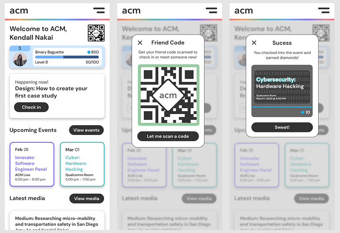
Based on these insights, I proposed a new way of checking in and interacting with members through individual QR codes.
Individual QR codes, or buddy codes would improve member initiation, engagement, experience, and retention because:
- There would always be someone to greet members at the door and check them in
- If an event was a person’s first time interacting with ACM there would be someone there to introduce them to the portal
- There would be reduced friction of typing in a code instead check-in would be scanning a code
Member’s experience begins from the time they come to their first event. I want to inspire their confidence in being rewarded for attending in addition to what they gain from actual events. At the moment, people are mainly ACM returners at events. Since this check-in process is routine, I worry that someone who’s first time it is at an ACM event could feel left out.
Picture this: a person is coming to their first ACM event as a first year college student. They are not quite sure what to expect but are brave enough to come out. They walk up and someone from ACM warmly greets them and asks them to pull up their buddy code. They ask “what buddy code?” The ACM representative replies “oh is this your first event? Let me explain the membership portal to you…” This is a vastly different experience than potentially being ignored when walking into an event and not understanding where to input a check-in code.
Furthermore, buddy codes could bring members together. Since buddy codes represent individual profiles, it could scannable. Members could scan each other’s codes and bring up profiles to see badges, contact info, and what they do in ACM. This could add a touch of sociability by:
- Increasing friendly competition for the leaderboard and earning badges
- Making it easier to get to know somebody by having buddy codes as an introduction piece
- Making meeting people an activity (i.e. “Hey everyone meet 10 people around you by scanning buddy codes and you will receive diamonds to spend in the ACM Store!”)
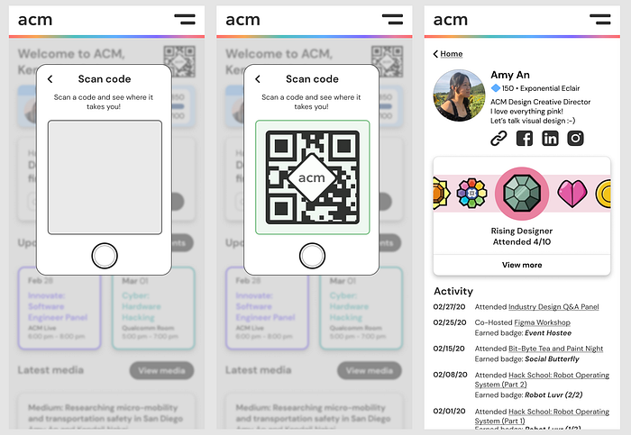
Some points brought up against checking every person in at a time was that it would make it slower to get into large events or the person checking people in might have a camera malfunction. In this case, the event check-in code would be a QR code as a backup and could be scanned just like a buddy code.
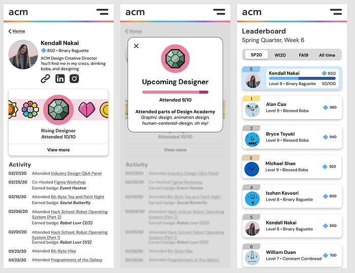
Member profiles: Incentivizing event attendance and profile use with interactive activity and badges
Membership points are the current form of friendly competition between members that incentives them to attend events, rank up, and later spend their points on swag in the ACM Store.
I found there are 125 out of 1036 members that have over 100 points with the highest 1% around 500–900 points. On average, 10 points are awarded per event checked into. 88% of members have a point disparity that is difficult to catch up to.
We wanted to make the portal more interactive for and between members. Members have expressed enjoyment of friendly competition with the leaderboard. I posed the member profile problem statements: How might we decrease the point disparity impact? How might we make all 1036 members feel relevant?
The solution was to create badges to display on member profiles and reset points at each quarter with there still being an “all-time” point system. These solved the point impact issues in that:
- Badges reward participation for anything from one event to a series to meeting new people by scanning buddy codes
- The creative freedom in designing badges and creating rewards for them is limitless
- Badges encourage use of profile, event attendance, and most importantly provide friendly competition more than just through points and the leaderboard
- Point resets at the beginning of each quarter discourage feelings of not being able to catch-up in rank while still maintaining long-term competitiveness
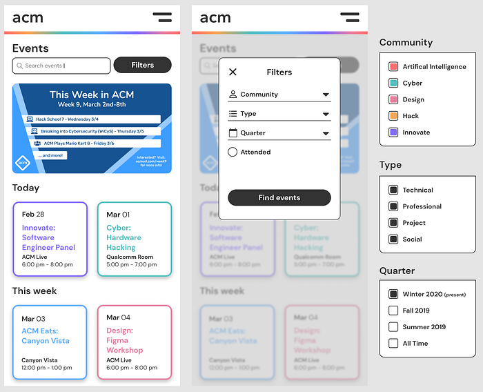
Event display: Making event details obvious with filters and color tagging
ACM has children organizations called communities and they each host their own themed events in addition to the main ACM events.

The interview results showed that members wanted more control of their events experience and there was lack of event communication. Some pain points were:
- Events were posted on Discord and Facebook but not always the portal
- Event covers were too small to read on the portal and members had to scroll on individual cards to see concrete details
- Members would like to see what events they had attended
- It was not always clear whether an event as a workshop or not
- Events were visually divided into upcoming events and every single past event (information overload)
A key design challenge was to consider how much emphasis should be given to what time and category of events.
I added the most upcoming events on the home page and created a dedicated events page. The idea was to insert more event searching and filtering features without overcrowding the home page. To add clarity to what kind of event a member was viewing, I removed the event covers and replaced them with color-coded event cards containing main event information like title, location, and date.
To give event experience control back to the members, I added a search and filter system. Events could be filtered by community, type, quarter, and whether they were attended by the member. Since I could not optimize events on the member’s behalf without limiting their experience, I gave them the flexibility to view the kind of event they were interested in rather than the previous experience of being forced to view every event ACM hosted.
Member feedback: Encouraging members to voice their input
Members like to be heard — David
There is a form linked to the ACM Discord for members to give general feedback or event suggestions. It has 0 responses. The lack of responses could be due to:
- Only 64.7% of members are a part of the ACM Discord (671 out of 1036)
- Lack of obvious access and reason to fill out the form
Surveys and interviews expressed giving general feedback would well-received but since there is already a way to, this likely means members do not know about the form.
To centralize information, I added internal feedback forms: quantitative feedback from events through simple reaction taps and qualitative feedback from detailed reports. Adding both allow flexibility in feedback for someone that only has a little time as well as a member that wants to give specific feedback. Both are incentivized with a reward of points for giving input. Feedback from events takes ~10 seconds and feels rewarding instantly. More detailed feedback feels impactful over time especially when put into implementation since each submission is to be viewed and acted upon by the ACM officer board.
I designed feedback forms with both member flexibility and privacy in their response. Event feedback a set of type-related positive and negative emoji response phrases. There is an option to add a custom response as well. General feedback is free-flowing. Since feedback can be sensitive, members might not want associate their name but still want to give input. The option to respond anonymously is default.

Keeping members in mind throughout all features of the design
Member-first or formally, human-centered design was at the forefront of my mind when we were designing. This showed in the details where we pushed for a user-friendly portal through microcopy, flexibility, and accessibility. We wanted to make the portal as friendly and welcoming through an online medium as ACM is in person. Therefore, we wanted our typography, color, and overall feel be bold, poppy, and modern yet inviting.
Microcopy
Microcopy is the tidbits of copy found throughout the portal. This is shown from when they first attempt to create an account where we promise to protect their information and during onboarding where we show we are happy they joined ACM. The main page always has an accompanying message greeting them from “Welcome” when they first make an account to “Good afternoon” to “We are so glad you’re here” each addressing them by name. Interaction with the portal by making friends, going to events, and earning badges is responded to with fun button messages like “Sweet,” “Cool,” and “Let’s go.”
Flexibility
ACM has a wide range of members: some members can attend a lot of events while others do not have time to, some members are outspoken and like to provide feedback while others enjoy enjoying things as they are, some members like to search and sort by keywords while others like tapping relevant topics, some members like to come and learn with just a little interaction while others like to mingle and interact. All types of interaction personalities I have witnessed in ACM online and in-person were accounted and accommodated for in the design. There’s an alternative to almost every way of interacting giving users flexibility in their experience.
Accessibility
While most of ACM is abled in every sense, we understand that UC San Diego has a diverse spectrum of talented students. We wanted to design for everyone in mind as much as possible. We still have a ways to go but our minimum font size for almost everything is follows the reccomended 14 pixels. Buttons are 35 pixels high but have a touch-target of the recommended 44 pixels. Colors are WCAG 2.0 compliant for contrast accessibility in dark mode at every size and weight and we are currently creating an accompanying palette to be accessible in light mode.
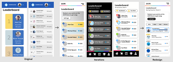
Design decisions: Converging divergent ideas at Design Jams
We diverged in design throughout the project in our user interviews and prototypes and converged during two Design Jams per week to discuss and empathize then make design decisions. Here are some views of the process from the original portal design through iterations of our designs to the final redesigned screens.
Disclaimer: Since this was a team effort, not all iterations screens are mine but all screens were discusses during design jams. Amazing contributions came from my stellar fellow designers Amy An, Alan Cao, Jennifer Pham, and Jack Yang.
Home
The original portal only had the the profile card, check-in input, and events on the home page. Since ACM is mainly based around events I wanted to maintain that events and checking in were a focus on the membership portal while allowing users to be able to explore other features right when they entered. However, ACM offers a lot of content like writing and video pieces and we wanted members to be able to visually see their that points increase after checking into an event.
Taking these factors into account, I revised the layout to allow for clear check-in at two areas and redesigned the point-updating profile-card to look like the one the member would see on the leaderboard. We shrunk the events space and added a media section, both accessible by buttons and seen upon entry. Since the membership portal was now something design was integrated into,
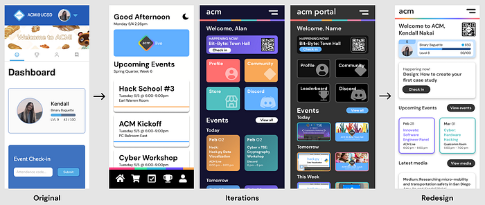
I also wanted a way to communicate the way the portal works or new changes, kind of like onboarding and patch notes. It is not shown but when a member creates their account for the first time they are walked through the onboarding process. If there are updates we want the members to know about, I added a drop down notification that emerges from below the rainbow bar.
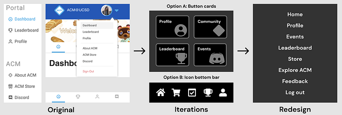
Navigation
There were a few methods of mobile navigation we considered:
- Bottom-navigation: offers ease of access of controls at single taps but adds an additional bottom bar and is not compatible with desktop web design (it is a website, not an native app)
- Hamburger: familiar to web and allows access to different links at all parts of the portal but navigation options are not visible upon entry
- Buttons: shows visuals and the the most important buttons on a “dashboard” but does not allow for access to other pages unless a member returns to home page, limiting design to pages close to home
We concluded on the hamburger navigations. While we like the ease of use at the bottom, this is web app, not a native application. We liked the buttons because of their ease of understanding, but concluded the navigation bar was most standard and did not limit the number of paths the user could take at any given time.
Event covers
The original main page mobile-view portal had single event cards both key information and an event cover. This was redundant because information was repeated which wasted space.
I iterated trying community color-coded event covers or event cards. In high-fidelity user testing, the covers were too small and seemed inconsistent while the fully colored cards were overwhelming to users that didn’t understand the colors at first.
I compromised by adding the event cover to the details when a member clicks on the card and changing the color-coding to a border. I also added the “This Week in ACM” graphic since it displays the featured events.
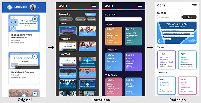
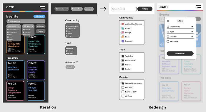
Event searching and filtering
There was no event filter system so I wanted to add one to give members flexibility in finding events they were interested in. I experimented in drop-down menus similar to what clothing stores have for filtering and added a search feature since members expressed it would be useful during high-fidelity testing.
However, the the filters seem squished, the font was too small to be accessible, I wanted to avoid using two lines of filters since that is discouraged, and having both a search bar and filter on top of each other seemed redundant. I realized the search bar could be condensed and an all-encompassing filters modal could be added. I redesigned the selection boxes to be larger and we added colored checkboxes to the communities filter to make the link between the colored borders and communities clearer. Making the filters a larger modal also offered design flexibility for adding more filters.
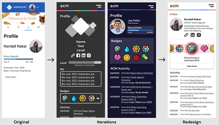
Profile layout
The original portal lacked features and member connectivity. We wanted to add badges and ways to reach out to members through their social media platforms and I wanted member activity for their reference and so members could see what events they shared. I experimented with different text alignments, badge layouts, and level-progress bars.
In the end we created a “featured” badge viewer with the flexibility to see all of them at once with a tap. Since profiles were meant to be more social now, I removed the level-progression and replaced it with overall diamonds and level to be the flex. I added a flexible bio section where members could decide to share their major, year, ACM community/officer position, or just a little about them.
Leaderboard
The original portal features the top three leaderboard as large cards and the rest are a long list with a spreadsheet-style alternating display. I wanted to add personality and interactivity to the leaderboard through leaderboard cards since they convey member profiles can be accessed. I also wanted the currency of point to be more playful and incentivizing by expressing them as diamonds, the shape of the ACM logo. I initially placed the rank in circles but realized this only worked for the top 10 out of 1000+ ranks. I changed the rank to a curved bar above the profile picture to be able to hold up to 4 digits without compromising font size.
To reduce feelings of not being able to catch up in points from new to seasoned members, we decided to reset points at the beginning of each school quarter while having an ongoing all-time points board to reward members that had been to a lot of events. We experimented with being able to go to one’s rank and the all-time leaderboard with the tap of a button or a switch. I discovered a solution would be to simply move the member’s card to the top rather than having to scroll down and add a color to distinguish their card from the rest. I also made previous quarter leaderboards available through a toggle so members did not feel like their progress was not lost immediately at the end of a quarter.
Light and dark mode
We experimented with both light and dark mode for the redesign. Our community is mainly computing, so a majority expressed interest in having a dark mode. Ultimately, we created a light mode of the minimum viable product since light mode is more widely used in industry and out of concern for accessibility but there will be both views in the final membership portal release.
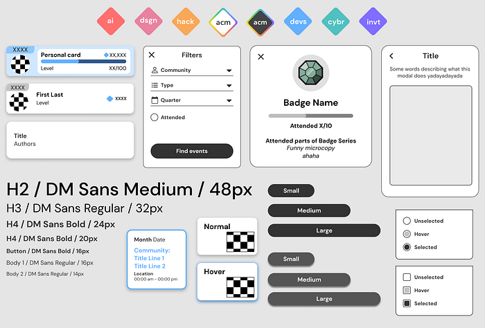
Style guide and design system: Consistency and efficiency
I wanted to maintain consistency and make it more efficient to edit components long term as well as create more ACM-standard graphics in the future. I created a modular design system with reusable components and their different states. I also created the style guide to set the foundation of ACM branding. You can find it at acmurl.com/design-jam.
Final reflections: More to come
This was the largest project I have taken on and I hope there are many more like this to come. Designing the ACM Membership portal was fun, friendship-building, messy in the best way, and challenging. Most of all, I learned a lot while making an impact on ACM. Here are my key takeaways:
- Collaboration brings together and creates ideas beyond what an individual could ever create their my own
- Letting go of ego is required for taking constructive critisism. On that note, ask anyone and everyone for feedback and absorb it all!
- Having a development team accompanying a project is priceless since they can give feedback on how feasible a design’s implementation is
- Do not be pixel-perfect until the end! Empathize, design, iterate! Be willing to start-over!
The ACM Membership Portal redesign is my child. I going to nurture it for far longer than the three months I did of it’s infancy. As the ACM Design team and I hand it off to development team we will work together more to evolve and polish the mobile visual and functional design to make it the most seamless member experience possible. We will also design a responsive accompanying desktop version and admin version.
If you would like to view the original membership portal, feel free to at members.acmucsd.com. The membership portal redesign will be released in December 2020 so check back then!
It will be amazing to see the ACM Design team’s work brought to life: a complete redesign and rebuild. I hope it will bring positive impact, engaging the 1000+ members of ACM in a friendly and fun way.